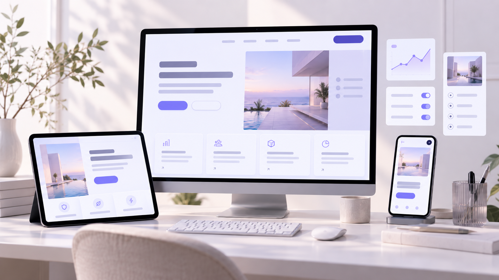
Web design trends are useful only when they improve the experience of the person using the website. A fashionable layout that hides the offer, delays the page or distracts from the next step is still poor design.
In 2026, the most valuable design direction is not visual excess. It is the combination of clear positioning, credible proof, responsive interaction and fast delivery. Modern websites must work for impatient visitors, mobile users, search engines and increasingly fragmented buying journeys.
Conversion-first minimalism
Minimalism in 2026 is less about empty white space and more about decision discipline. Every headline, visual, button and section should earn its position by helping the visitor understand the offer or move forward.
This approach creates pages with stronger hierarchy, fewer competing actions and more deliberate pacing. It is particularly effective for service businesses, B2B companies and complex offers that are easy to over-explain.
How to simplify without making the page generic
- Give every page one primary conversion goal.
- Reduce navigation choices that do not support the current journey.
- Use contrast to identify the next action immediately.
- Remove repeated claims that add length but not confidence.
- Keep enough brand character to remain recognisable.
Minimal does not mean empty. It means intentional.
Outcome-led hero sections
The first screen is becoming more direct. Instead of leading with a broad slogan, high-performing hero sections explain the outcome, identify the audience and provide a clear next step.
A visitor should be able to understand what the business offers, why it matters and what to do next without scrolling through several sections. Supporting proof can then reduce the risk attached to that first action.
Build the first screen around one decision
What meaningful result can the customer expect?
Who is the offer for and what problem does it solve?
What is the clearest useful step the visitor can take?
Modular content and bento-style systems
Bento grids remain visible in 2026, but the strongest implementations use them as an information system rather than a decorative pattern. Different card sizes establish priority and allow related benefits, services, proof and data to be understood together.
Modular layouts are also easier to adapt across landing pages, campaign pages and different screen sizes. A strong module can be reused without making every page feel identical.
Use modular layouts to clarify complex offers
Start by grouping information according to the questions customers ask. Give greater visual weight to the strongest differentiator or most important result. Supporting details can sit in smaller modules around it.
“A good modular system makes complex information easier to scan without turning the page into a collection of disconnected cards.”
Micro-interactions that confirm progress
Small interactions can make a website feel significantly more responsive. A button that confirms a click, a form field that provides immediate guidance or a filter that visibly updates results helps users understand that the interface is responding correctly.
The important shift is from decorative animation to functional feedback. Micro-interactions should explain a state change, confirm progress or draw attention to useful information.
Design feedback that supports the next action
- Show clear hover and keyboard-focus states.
- Confirm successful form submissions immediately.
- Explain errors beside the relevant field.
- Use progress indicators for multi-step forms.
- Keep interaction timing quick and consistent.
Proof-led design instead of isolated testimonials
Trust is increasingly designed into the complete page rather than placed in one testimonial carousel. Relevant proof now appears beside the claim it supports: a case-study result near a service benefit, a review near a booking action or a client example near a technical capability.
Specific proof is more persuasive than broad praise. Names, numbers, locations, project details and visible outcomes help visitors judge whether the experience is relevant to them.
Place proof beside the claims it validates
Intent-based journeys and progressive personalisation
Visitors rarely arrive with the same level of knowledge or urgency. Modern websites increasingly create clear paths for different intentions without forcing everyone through one generic page.
This does not require aggressive tracking or a complicated personalisation platform. Useful segmentation can begin with the choice a person makes: the service they select, the problem they identify or the level of support they need.
Personalise paths without creating confusion
Keep the main proposition consistent, then allow visitors to move toward audience-specific proof, service information or calls to action. The interface should still feel predictable when people move between paths.
Accessible interaction as conversion infrastructure
Accessibility is becoming a core part of interface quality. Clear focus states, suitable target sizes, readable contrast, keyboard access and predictable help make websites easier to use for a wider audience.
These decisions frequently improve the experience for everyone, especially on mobile devices or in distracting environments. The WCAG 2.2 guidance provides a practical reference for current accessibility requirements.
Treat accessibility as part of the initial design system
- Maintain sufficient colour contrast for text and controls.
- Keep keyboard focus visible and unobstructed.
- Use descriptive labels for forms and interactive elements.
- Provide useful alternative text for meaningful images.
- Do not rely on colour alone to communicate status.
Purposeful motion with a quieter visual rhythm
Motion remains an important part of modern digital experiences, but indiscriminate animation is losing value. Constant movement can compete with the message, make the page feel slower and create accessibility problems.
The stronger direction is a quieter rhythm: subtle section reveals, meaningful transitions and focused demonstrations that help users understand a product, process or relationship.
Give every animation a measurable job
Before adding motion, ask whether it explains, confirms, guides or demonstrates something important. If it does none of these things, the static version may be clearer and faster.
Performance treated as part of the visual system
A visually polished website loses commercial value when its main content loads slowly, controls respond late or page elements shift while someone is trying to interact.
Performance decisions must begin during design, not after development. Image dimensions, font choices, animation complexity, third-party scripts and page structure all influence the final experience.
Protect Core Web Vitals from the start
Current Core Web Vitals guidance defines good performance as an LCP of 2.5 seconds or less, INP of 200 milliseconds or less and CLS of 0.1 or less at the 75th percentile.
Structured content for people, search and AI discovery
Clear content structure has become even more important as visitors discover businesses through traditional search, AI-generated answers, social platforms and direct recommendations.
Strong headings, direct answers, descriptive links, meaningful image alternative text and logical section order make a page easier to understand for both people and machines.
Create reusable content rules, not one-off pages
- Use one descriptive H1 for the primary page topic.
- Organise major topics with useful H2 headings.
- Use H3 headings for supporting questions and practical guidance.
- Write descriptive image alt text without keyword stuffing.
- Add relevant structured data when the page type supports it.
- Keep important answers available in the HTML content.
Google’s image SEO documentation recommends standard HTML image elements, descriptive alt text and relevant high-quality images placed near supporting content.
How to choose the right web design trends for your business
You do not need to apply all ten trends. Start with the biggest source of friction in the current customer journey. For a new build or focused redesign, our website design and development service turns those priorities into a clear implementation plan. If an existing site is being replaced, use the website redesign SEO checklist to protect valuable URLs, content signals and search visibility during the relaunch.
Start with the problem, not the visual style
If visitors do not understand the offer, begin with positioning and hierarchy. If they understand but do not trust it, strengthen proof. If they start forms but do not finish, improve interaction, reassurance and feedback. If the website is slow, fix performance before adding another layer of visual complexity. See how these principles come together in The Renovation Team website project.
Test the outcome, not the decoration
Measure whether the updated experience helps more people reach a meaningful action. Useful indicators can include qualified enquiries, form completion, product exploration, booked calls and progression between important pages.
Match the trend to the conversion problem
Use the customer journey to decide what deserves attention first. This keeps the redesign focused on an observable problem instead of turning every trend into a visual requirement.
Prioritise outcome-led messaging, simpler hierarchy and proof beside the main claim.
Improve form feedback, accessibility, mobile interaction and page performance.
Use modular content, intent-based paths and structured information to guide decisions.
Frequently asked questions
Which web design trend has the greatest effect on conversions?
Clarity usually creates the strongest starting point
Clear positioning, focused hierarchy and one obvious next action often have a greater effect than adding a new visual feature. Performance and relevant proof then strengthen that foundation.
Do we need a full redesign to use these trends?
Many improvements can be introduced through a focused refresh
Hero messaging, calls to action, trust signals, page speed and accessibility can often be improved without replacing the complete website. A full redesign makes more sense when the structure or positioning no longer supports the business.
Are animations good or bad for conversion?
Animation is useful when it supports understanding
Motion can guide attention, explain a process or confirm an action. It becomes counterproductive when it distracts from the message, delays interaction or ignores reduced-motion preferences.
How should we measure the success of a website redesign?
Measure meaningful customer progress
Track qualified enquiries, bookings, purchases, form completion and movement toward important pages. Combine analytics with customer feedback to understand why performance changed.